How a Poor Design Can Destroy Your Investment
A poorly executed wrap doesn’t just lose impact — it can damage your brand image and turn away potential customers.
Here are the most common mistakes to avoid if you want your wrap to truly sell.

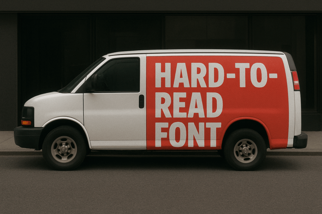
3. Complicated Typography
Fonts that are too decorative or too small are impossible to read, especially on a moving vehicle.
🟡 Tip: Use clean, bold, and legible fonts. Prioritize clarity over creativity.
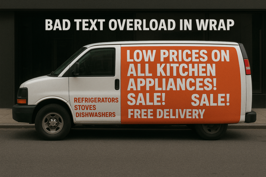
1. Too Much Information
When your vehicle is on the move, you only have a few seconds to deliver your message.
If your design is cluttered with text, icons, or images, viewers won’t know where to look.
🟡 Tip: Simplify. Focus on one main message and a clear call to action.
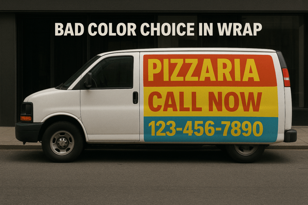
2. Poor Color Choices
Bad color combinations or weak contrast make your wrap unreadable.
A dark background with dark text—or too many bright colors—will make people ignore it.
🟡 Tip: Make sure text and graphics are visible from a distance and under different lighting conditions.
4. Poor Installation
No matter how good the design, a bad installation ruins everything.
Wrinkles, bubbles, and uneven cuts not only look unprofessional but also shorten the wrap’s lifespan.
🟡 Tip: Always hire certified professionals for your vehicle wrapping.
5. Hard-to-Find Contact Information
A beautiful wrap means nothing if people can’t easily see your phone number, website, or social media.
🟡 Tip: Place your contact info strategically and make sure it’s readable from several meters away.

A successful wrap requires strategy, design, and professional execution.
Avoiding these common mistakes will save you time, money, and missed opportunities, ensuring your vehicle becomes a true marketing asset — not a liability.